Software Dev

At a glance: flow layout βŽ“

Continuing with the iOS at a glance series, we’re still digging our way though the old fundamentals of layout.

Introduced way back in iOS 6 with the initial collection view offering, the flow layout gave developers a more natural and fluid way to lay out views than the OG table view.

A flow layout lets your subviews flow just like words on a page (at least in English), from left to right and top to bottom, as the blue pencil line shows below.

The blue pencil lines here illustrate the flow layout working, but of course what the user actually sees is just the subviews.

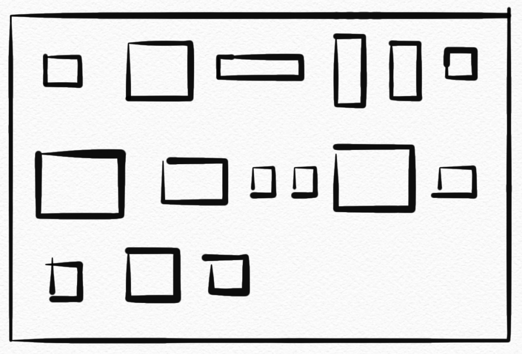
Flow layouts support landscape or portrait scrolling and have a variety of options such as making all the items different sizes or the same size, adding sections (below), adding section headers and footers, and controlling spacing and alignment.

Software Dev

At a glance: hugging and resistance on iOS

Continuing the iOS at a glance series, giving you a quick visual of an iOS concept, let’s jump to and old and simple, but oddly confusing, topic: content-hugging priority and compression-resistance priority!

Okay, that is a mouthful for two simple, related ideas.

Apple is great at giving its consumer products some nice, catchy names. But the APIs? Well, they’re working on it. These are the guys who, long ago, gave us the “Autoresizing mask”.

Content hugging priority is basically how much a view “wants” to shrink down to its minimal size when put under pressure.

I’ll just call this “shrink-wrap-iness” because it shrinks down like plastic wrap.

While compression resistence priority is how much a view “wants” to expand when given the space.

I’ll call this “balloon-iness” because it expands like a balloon.

The higher the value in any direction, the “more” the view prioritizes that stance compared to other views.

So there it is at a glance. βœ… Hopefully that makes the idea more memorable, at least.

If that doesn’t help, maybe this will. πŸ˜‰

For details and concrete examples, check out this article or this tutorial.

Software Dev

Test your SwiftUI views at rocket speeds πŸš€ with ViewInspector πŸ•΅οΈβ€β™‚️

For years, at least in the iOS world, the idea of automatically testing your UI views was considered out of pocket. After all, the UIKit views lived in non-code files such as a storyboard or a – good lord! – a XIB.

Then came Apple’s XCUI framework, which allows for automatic UI test but takes, more or less, forever to run. I’ve seen XCUI test plans run for 3 hours, 6 hours, even 24 hours. It kind of works for a nightly test on a dedicated server, but not in realtime as you code.

But with SwiftUI, you get concise, clean, cross-platform view-layer code and can now test SwiftUI view as, well, code! This mean you can unit test your views 🀯, thanks in particular to the open source ViewInspector framework.

πŸ‘‰ ViewInspector on GitHib

ViewInspector lets you traverse your view hierarchy at runtime, asserting values as you go in traditional unit-test style.

According to the Inspection Guide, ViewInspector supports dynamic testing of @Binding, @ObservedObject, @State, @Environment and @EnvironmentObject. You can even interact with the interface, such as tapping a button and checking the result.

And it all runs in blazing fast unit test speed πŸš€ so your tests don’t have to run all night.

If you still want to do some actual visual testing, consider snapshot testing or mix in some limited XCUI tests for the right balance.

Now you can go write something cool and iterate fast. Thank you, nalexn, for this great tool. πŸ™

Software Dev

“Sketching” out an app prototype

I’ve learned a lot making apps for big companies, mostly about process: how a good continuous integration process works, how code reviews can be productive (or not productive), how to break a big app into smaller components so lots of people work on related things at the same time.

Still, it’s helpful to do something fresh and new 100% on your own from time to time. Doing something new all your own, you get to try any architecture you want, go all in on the latest asynchronous programming techniques, fully embrace the amazing new(ish) declarative/reactive view layer, and even try out a new CI framework to two.

But the most fun part of all is developing the idea of your app. What does your app do? How exactly does it work from a user perspective? And what do the screens look like in detail?

πŸ‘‰This time around, I’m prototyping my new app idea on my phone so that I can get a feel for how it works in my hands before writing all that code. ^

I tried out a few prototyping tools. After looking at some basic options and some pretty involved options (arguably too involved), I landed on a pretty “sketchy” Mac app that handles full-on detailed UI design and kind of does mobile prototypes through its “mirroring” iOS app. Perfect. πŸ‘Œ

πŸ‘‰ Sketch | mirroring app

I will say that Figma looks pretty promising as well. What nudged me over to Sketch was Apple’s Sketch-compatible design resources. There are some third-party iOS design resources for Figma, but I’d rather go with Apple’s official offering. Sorry, Figma. πŸ€·πŸ»β€β™‚οΈ

So my new design process is this, now that I’ve finally learned Sketch:

Rough sketch on paper ➑ realistic visual design in Sketch ➑ prototype on a phone ➑ code

My instinct is to talk about the app itself while it’s in progress, but sorry… that’s top secret for now. πŸ•΅οΈβ€β™€οΈ

Software Dev

It’s Time for Snapshot Testing

I love the idea of snapshot testing. It’s a simple way to automatically test an app’s UI.

It works like this:

  1. Set the app up in a certain state and take a screenshot. Save the screenshot. πŸ“Έ
  2. Next time when you run the same test, you compare screenshots. πŸ“· πŸ“Έ
  3. If something changed unexpectedly, then you know there’s trouble. πŸ’₯

Here’s a nice series about how to do it for iOS/ Xcode.

πŸ‘‰ Snapshot Testing. Testing the UI and Beyond (Part 1)

And GitHub: swift-snapshot-testing

The coolest thing is that you actually upload your screenshots in any new pull requests, so you can literally see what the change is all about (“The perfect pull request”). 🀯

Image for post

Via iOS Dev Weekly.