Software Dev

At a glance: frames and bounds πŸ–ΌοΈ

Next up in the iOS fundamentals at a glance series: frames and bounds.

This is such a fundamental idea that there are a ton of articles and videos on this topic. But here’s the most basic idea…

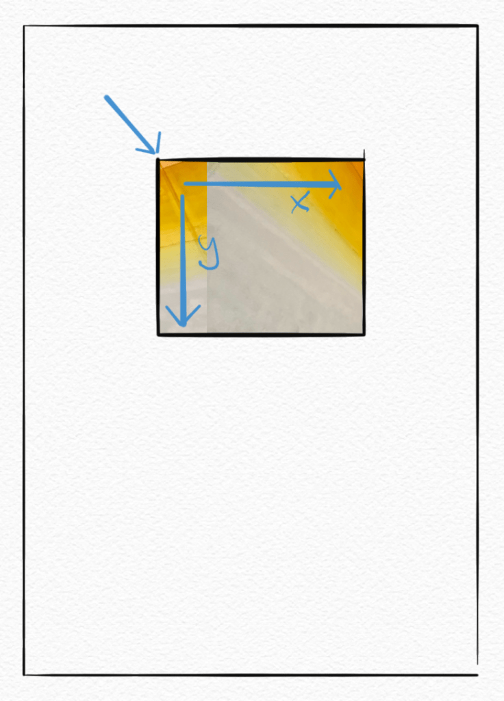
Unlike some previous concepts, the term frame is perfect here because it’s just like a frame on a wall.

A frame (subview) is placed on the wall (superview). The frame has a location, defined by its origin in the upper-left, and a size, plus an x/y coordinate system.

Simple enough, right?

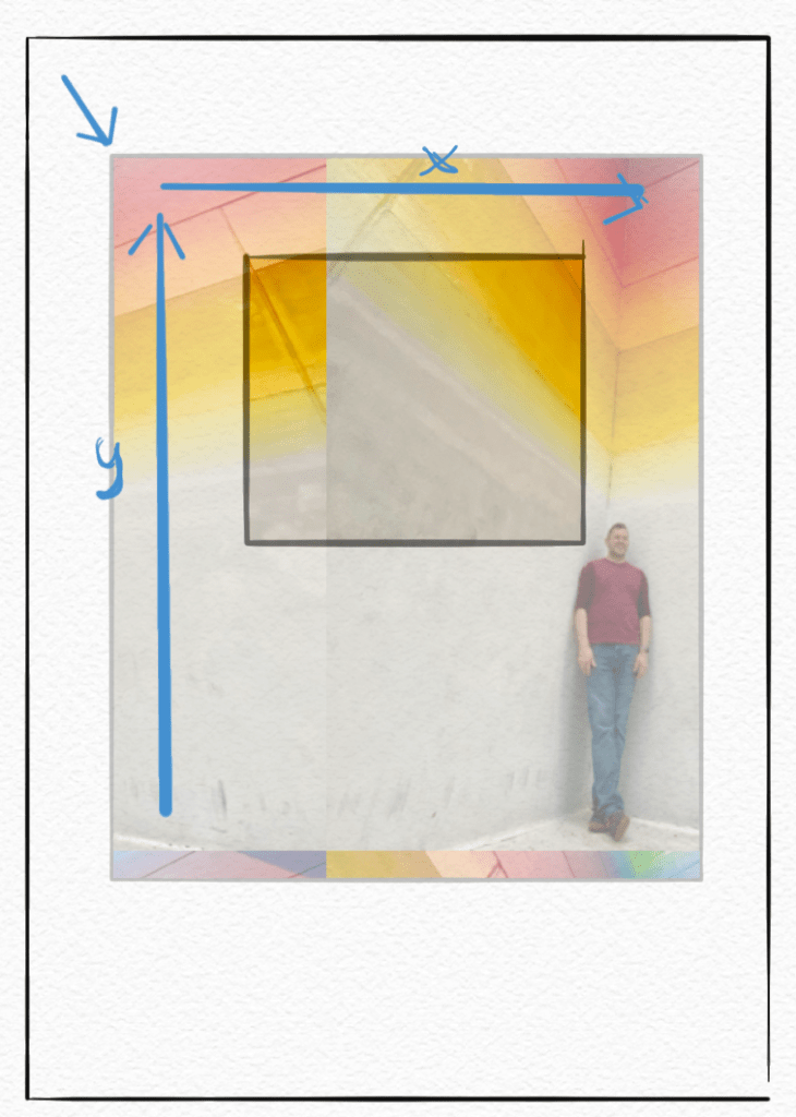
Bounds gets a little more confusing. It should probably be called “window” since it defines what part of a potentially larger view you see, but that term was already taken, so here we are with “bounds”.

Like its frame, a bounds also has its origin in the top-left, plus a size and its own x/ycoordinate system. Oddly enough, the y-axis works opposite of the frame. πŸ€¦πŸ»β€β™‚οΈ They do this just to make programming hard, right?

Here we can see that the frame above only showed us part of a bigger picture; what we see is defined by the bounds.

This concept is especially useful for scroll views, which essentially let you move the bounds around to look at different parts of the view.

I hope that helps. And if you ever get confused, remember a frame picture of a wall, like this one at the local coffee shop.

Software Dev

At a glance: flow layout βŽ“

Continuing with the iOS at a glance series, we’re still digging our way though the old fundamentals of layout.

Introduced way back in iOS 6 with the initial collection view offering, the flow layout gave developers a more natural and fluid way to lay out views than the OG table view.

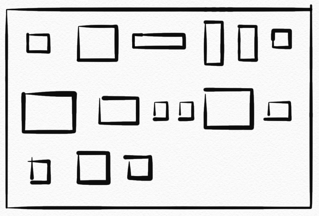
A flow layout lets your subviews flow just like words on a page (at least in English), from left to right and top to bottom, as the blue pencil line shows below.

The blue pencil lines here illustrate the flow layout working, but of course what the user actually sees is just the subviews.

Flow layouts support landscape or portrait scrolling and have a variety of options such as making all the items different sizes or the same size, adding sections (below), adding section headers and footers, and controlling spacing and alignment.

Software Dev

At a glance: hugging and resistance on iOS

Continuing the iOS at a glance series, giving you a quick visual of an iOS concept, let’s jump to and old and simple, but oddly confusing, topic: content-hugging priority and compression-resistance priority!

Okay, that is a mouthful for two simple, related ideas.

Apple is great at giving its consumer products some nice, catchy names. But the APIs? Well, they’re working on it. These are the guys who, long ago, gave us the “Autoresizing mask”.

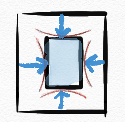
Content hugging priority is basically how much a view “wants” to shrink down to its minimal size when put under pressure.

I’ll just call this “shrink-wrap-iness” because it shrinks down like plastic wrap.

While compression resistence priority is how much a view “wants” to expand when given the space.

I’ll call this “balloon-iness” because it expands like a balloon.

The higher the value in any direction, the “more” the view prioritizes that stance compared to other views.

So there it is at a glance. βœ… Hopefully that makes the idea more memorable, at least.

If that doesn’t help, maybe this will. πŸ˜‰

For details and concrete examples, check out this article or this tutorial.

Software Dev

Autoresizing at a glance βˆ

Kicking off the iOS development β€œat a glance” series, we’ll start pretty basic: autoresizing.

Autoresizing was Apple’s first shot in the days of yore (iOS 2, circa 2011) at letting early iPhone views rearrange themselves (this is the “auto” part) in response to screen rotations. It was limited and clumsy, as was pretty much all of iOS at the time. Mail, contacts, calendars, and the App Store were new features on the iPhone.

So autoresizing makes for a fitting intro to this series.

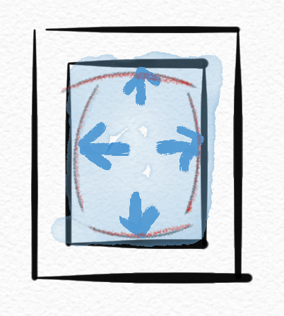
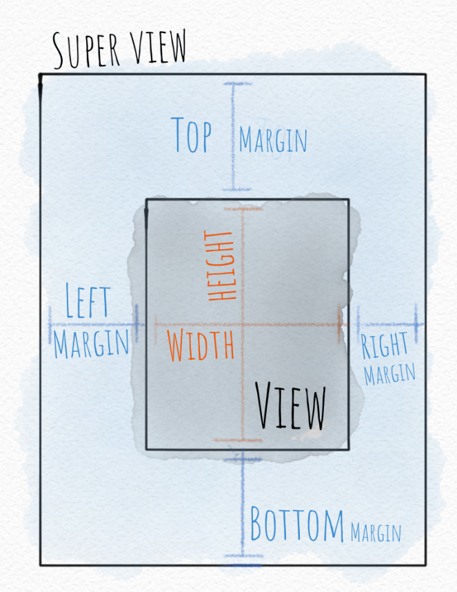
Autoresizing allows the developer to specify how one view relates to its super-view as far as its size and margins, and which parts are are flexible vs. fixed.

In the days since autoresizing was introduced, more capable layout tools like Auto Layout with constraints and now SwiftUI have been introduced.

But you’ll still see the autoresizing “mask” (an old-school programming term) hiding out in the Size Inspector in Xcode under the View section. If you wondered what that was, now you know.