Software Dev

At a glance: stack views

Next up in iOS at a glance series, where I give you a quick visual about an iOS development concept, we’ll jump into stack views.

Sticking with old-school UIKit concepts a little conger, stack views give us a simple way (pre-SwiftUI) to lay out a screen without a bunch of constraints, which can quickly become ungainly.

Stack views just organize subviews in a row, either vertically or horizontally. Stack views can be combined with each other as well to create complex layouts, such as below.

Stack views are typically invisible and only used to contain other views, so what we actuality see is this.

So there it is: stack views boiled down to a quick visual. Of course, the topic goes much deeper, including options for distribution, alignment, and spacing.

Software Dev

At a glance: hugging and resistance on iOS

Continuing the iOS at a glance series, giving you a quick visual of an iOS concept, let’s jump to and old and simple, but oddly confusing, topic: content-hugging priority and compression-resistance priority!

Okay, that is a mouthful for two simple, related ideas.

Apple is great at giving its consumer products some nice, catchy names. But the APIs? Well, they’re working on it. These are the guys who, long ago, gave us the “Autoresizing mask”.

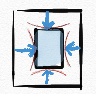
Content hugging priority is basically how much a view “wants” to shrink down to its minimal size when put under pressure.

I’ll just call this “shrink-wrap-iness” because it shrinks down like plastic wrap.

While compression resistence priority is how much a view “wants” to expand when given the space.

I’ll call this “balloon-iness” because it expands like a balloon.

The higher the value in any direction, the “more” the view prioritizes that stance compared to other views.

So there it is at a glance. βœ… Hopefully that makes the idea more memorable, at least.

If that doesn’t help, maybe this will. πŸ˜‰

For details and concrete examples, check out this article or this tutorial.

Software Dev

Autoresizing at a glance βˆ

Kicking off the iOS development β€œat a glance” series, we’ll start pretty basic: autoresizing.

Autoresizing was Apple’s first shot in the days of yore (iOS 2, circa 2011) at letting early iPhone views rearrange themselves (this is the “auto” part) in response to screen rotations. It was limited and clumsy, as was pretty much all of iOS at the time. Mail, contacts, calendars, and the App Store were new features on the iPhone.

So autoresizing makes for a fitting intro to this series.

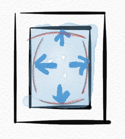
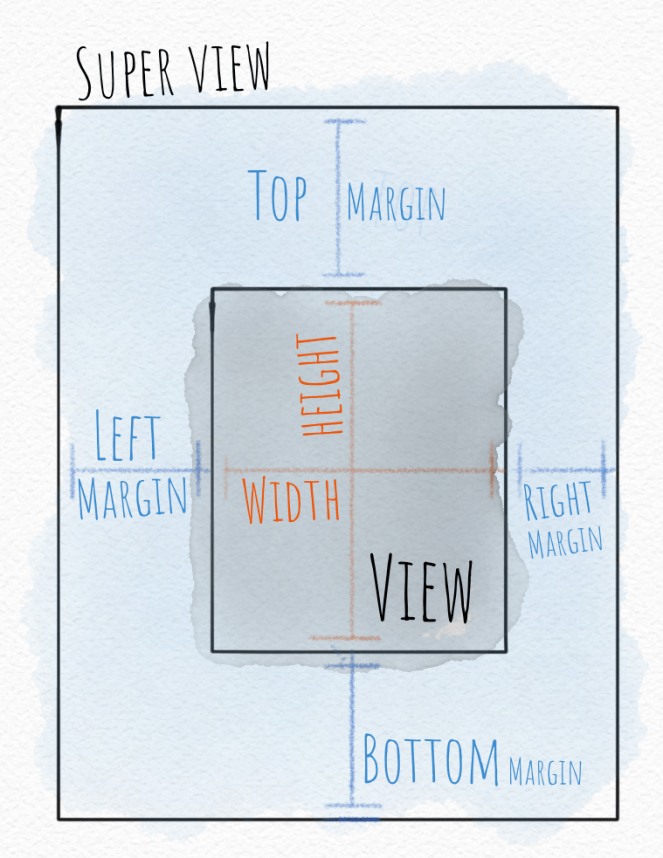
Autoresizing allows the developer to specify how one view relates to its super-view as far as its size and margins, and which parts are are flexible vs. fixed.

In the days since autoresizing was introduced, more capable layout tools like Auto Layout with constraints and now SwiftUI have been introduced.

But you’ll still see the autoresizing “mask” (an old-school programming term) hiding out in the Size Inspector in Xcode under the View section. If you wondered what that was, now you know.