Oaky, coolest app ever (if you’re an iOS dev). 🤯 Or at least the most useful.
Adaptivity let’s you experiment with size classes, margins, safe area, and so much more on a live device.
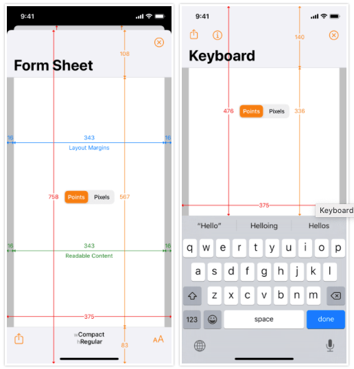
Via iOS Dev Weekly.
Oaky, coolest app ever (if you’re an iOS dev). 🤯 Or at least the most useful.
Adaptivity let’s you experiment with size classes, margins, safe area, and so much more on a live device.
Via iOS Dev Weekly.
Specific accessibility tips for making a UX friendly for people with autism, anxiety, dyslexia, or low vision from a Speech and Language Therapist. 👍
Via iOS Dev Weekly.
I make apps for a living. And one of the things that annoys me most is when an app just can’t handle being offline. It needs to be connected or else it acts unhappy or sick. I love apps that are offline first and silently sync with the network whenever they can. Some examples are Things, 1Password, or the stock iOS Calendar app. I know it isn’t always possible for an app to work offline. You can’t have all the movies on your device, after all. But a non-anxious offline app is a worthy goal that we app developers often forget about as we work through the endless details of making something work at all.
👉 My Apps Have an Anxiety Problem
Above is a great article kind of about offline apps. It’s not a UX article and not a software development article. But it does give a very human-centered perspective on “offline mode” and why it can be so agitating when it’s half-baked or too needy. 😆
My favorite quote from the article…
We often speculate the end of computing looks like an all-knowing orb or a Skynet spawning android super-soldiers to murder us. But maybe it just looks like a beachball that never stops spinning, never lets us open our apps because they are always fetching the latest data. Wouldn’t that be funny?
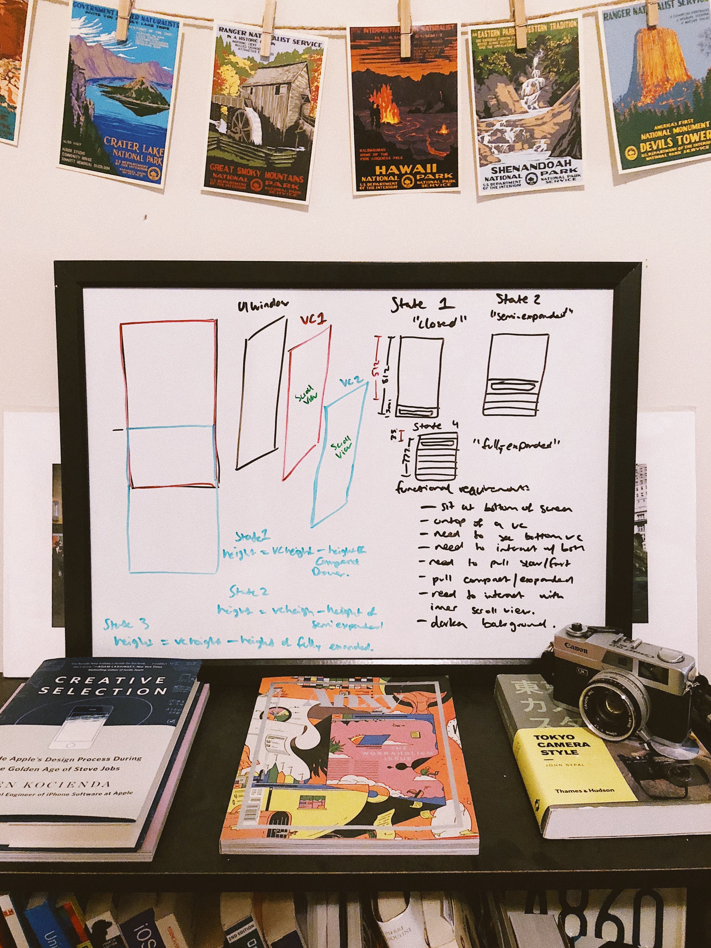
Deep dive into the interactive animations in the Sire Shortcuts app. I need to spend some time and understand this. It’s pretty involved.
👉 Re-creating the Siri Shortcuts Drawer Interaction
PS I love the nice whiteboard he came up with for the architecture.
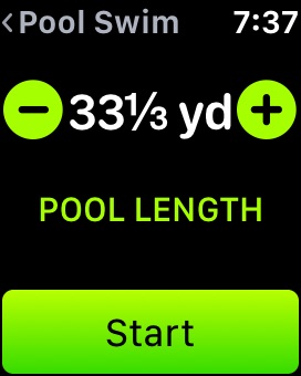
As noted in this post , I’ve been swimming at a pool that is 33 ⅓ yards (100 feet) long instead of the usual 25 years. I had been tracking this length as 33 yards on my Apple Watch. But recently they added an actual “33 ⅓” length between 33 and 34. Even though that ⅓ of a yard doesn’t make a real difference to me in terms of health tracking, this still made my day because they were thinking of me and this weird pool. 👍
It shows what kind of impact attention to detail can have in a user interface. What can I say? I feel understood. 🤷🏻♂️
